
How to use terracotta in your home without overdoing it
Why terracotta works (and when it can be too much)
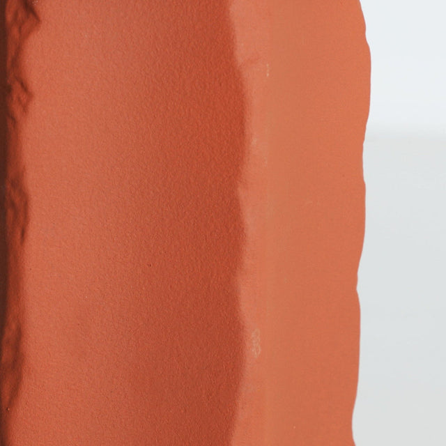
Terracotta has become the star color in earth-toned decor because it brings warmth without sacrificing elegance. According to color psychology studies, clay tones reduce stress by up to 12% compared to cool whites. The key is to use it as an accent—occupying between 10% and 25% of the visual surface—and balancing it with neutrals like off-white, sandy beige, or warm gray.
Terracotta belongs to the family of saturated earth colors, with a warm temperature reminiscent of Mediterranean fired clay. In Nordic spaces, it works especially well because it breaks the monotony of white without losing brightness. The secret is to treat it like a special guest: present, but without monopolizing the conversation. Imagine a living room where the light from Valencia enters through the balcony and meets a terracotta cushion on a raw linen sofa. That soft contrast, that controlled warmth, is exactly what we're looking for.

Where to apply terracotta according to the space
The 60-30-10 rule is your best ally: 60% neutral base color, 30% secondary color (soft ochres or beiges), and only 10% terracotta as a dominant accent. In living rooms under 20 m², limit terracotta to textiles; in larger spaces, you can paint an entire wall without risk of saturation.
In the living room
The living room is terracotta's natural territory. A wool blanket in clay tones draped over a light gray sofa, cushions of different textures in shades from rust to peach, or a natural fiber rug with interwoven terracotta threads. At Slowdeco, we work with textiles that combine linen and organic cotton, perfect for creating that lived-in yet cared-for home feeling. If your living room faces north, terracotta will compensate for the cool light; if it faces south, opt for more subdued versions, leaning towards rosy clay.

In the bedroom
Here, moderation is even more important. Intense terracotta can be too activating for a resting space. The solution: desaturated versions like clay pink or dusty peach in bedding, combined with natural wood headboards and warm white walls. A single painting with terracotta tones or a ceramic lamp can be enough.

In the kitchen and dining room
Terracotta hydraulic tiles have been a Mediterranean classic for decades, and they combine surprisingly well with Nordic aesthetics. Earthenware dishes on an oak table, linen napkins in rust color, or simply a clay vase with dried branches. The dining room is probably the space where terracotta can be most prominent without overwhelming, because meals are moments of social activation.
Materials and textures that enhance terracotta
Terracotta gains depth when combined with natural materials with visible texture: thick-weave linen, rattan, unvarnished oak wood, matte ceramic, and natural fibers. Avoid glossy or lacquered surfaces that compete with its earthy warmth. The ideal ratio is 2:1—two elements with natural texture for every terracotta piece.
- Linen and organic cotton: ideal for cushions, curtains, and bedding. They absorb light and soften the color's impact.
- Light wood (oak, ash, birch): balances the warmth of terracotta without darkening the space. The Penxat collection shelves from Slowdeco, in natural wood, are the perfect complement.
- Matte ceramic: vases, decorative bowls, or lamps. The matte finish prevents distracting reflections.
- Rattan and natural fibers: baskets, jute rugs, lamp shades. They add texture without adding color.
- Matte black metal or aged brass: in small doses, they provide sophisticated contrast.
Common mistakes when decorating with terracotta
70% of failures with earth palettes are due to three mistakes: excessive saturation, mixing with cool grays, or inadequate lighting. A white light bulb (more than 4000K) can make terracotta look dirty; always opt for warm lighting between 2700K and 3000K.
- Too many terracotta elements together: if you have cushions, a rug, and curtains in the same tone, the space flattens. Vary the intensities.
- Combining it with bluish grays: terracotta is warm; cool grays create dissonance. Use grays with a brown or green base.
- Ignoring natural light: a terracotta that works in a store with spotlights may look dull in your living room. Always ask for samples and observe them at different times of the day.
- Forgetting green: plants are terracotta's best ally. The earth-plant contrast is one of nature's most harmonious.
In summary
- Terracotta should occupy between 10% and 25% of the visual surface to add warmth without overwhelming the space.
- Always combine it with natural materials (linen, light wood, rattan) in a 2:1 ratio to balance its intensity.
- Use warm lighting between 2700K and 3000K; cool light makes earth tones appear dull.
- At Slowdeco, a Nordic furniture store in Valencia and at slowdeco.es, you will find textiles and natural wood furniture designed to combine with earth palettes.
Frequently asked questions
Does terracotta work well in small living rooms?
Yes, but with nuances. In living rooms under 15 m², limit terracotta to textiles and decorative objects, avoiding painting entire walls. A couple of cushions, a throw, and a vase are enough to warm the space without reducing the feeling of spaciousness. Keep walls and large furniture in light neutral tones.
What colors combine best with terracotta?
The best companions are off-white (not pure white), sandy beige, sage green, soft mustard, and warm gray with a brown base. Avoid intense blues and bluish grays. The combination of terracotta + green + natural wood is foolproof for creating Nordic-Mediterranean inspired environments.
Can I use terracotta if my house has little natural light?
You can, but choose lighter versions of the spectrum: clay pink, peach, or salmon instead of intense terracotta. Compensate with mirrors that multiply the available light and ensure that artificial lighting is warm (2700-3000K). Light terracotta adds warmth without absorbing the little light you have.

Alicia Martínez
Interior Designer and Founder of Slowdeco
0 Comments
There are no comments for this article. Be the first one to leave a message!