
The influence of color on the choice of TV furniture
The color of TV stand colors The furniture you choose for your living room transcends mere aesthetics, becoming a determining factor that influences spatial perception, mood, and decorative coherence in the most social space of your home. In modern living room decor , the TV unit acts as an unavoidable focal point that visually structures the room, making its color dramatically impact the overall atmosphere. The right color choice can make small living rooms seem larger, cold spaces gain warmth, or neutral environments acquire a distinctive personality, demonstrating that color is not just a decorative accessory but a fundamental psychological and compositional tool that defines how you experience your living room every day.
Color psychology applied to living room furniture
Colors generate scientifically documented emotional and psychological responses that influence how you feel in spaces where you spend significant time. Warm tones like terracotta, tile, or reddish woods stimulate conversation and conviviality, making them appropriate for living rooms where you frequently socialize and want to create welcoming atmospheres. TV furniture These warm tones function as visual anchors that invite people to gather around, enhancing the social function of the living room as the heart of the home.
Cool tones like greens, blues, or grays create a feeling of calm and serenity, appropriate for living rooms that also function as spaces for rest or reading where you seek relaxation after intense days. Nolla moss green TV unit It exemplifies how muted greens bring natural freshness without excessive coldness, creating environments balanced between dynamism and tranquility. This ability of green to connect with nature without sacrificing urban sophistication makes it an increasingly popular choice in modern living room decor .
Neutrals like whites, beiges, or grays act as canvases that allow other decorative elements to add color without saturation, a minimalist philosophy where the TV stand colors Neutral colors facilitate future decorative evolution without requiring furniture changes. white TV furniture They maximize brightness by reflecting natural light, an invaluable trick in rooms with small windows or a north-facing aspect where every ray of light must be used to its fullest potential. This chromatic versatility of neutrals represents a safe investment that remains relevant even as your tastes evolve.

Color saturation also plays a significant role: intensely saturated colors like emerald green, Klein blue, or deep terracotta create a dominant visual presence appropriate for bold personalities, while desaturated versions of the same shades (sage green, grayish blue, muted terracotta) offer subtle sophistication suitable for those who appreciate understated elegance. This gradation of intensity allows you to finely adjust the visual impact of the furniture depending on how much prominence you wish to give it in the overall composition of the living room.
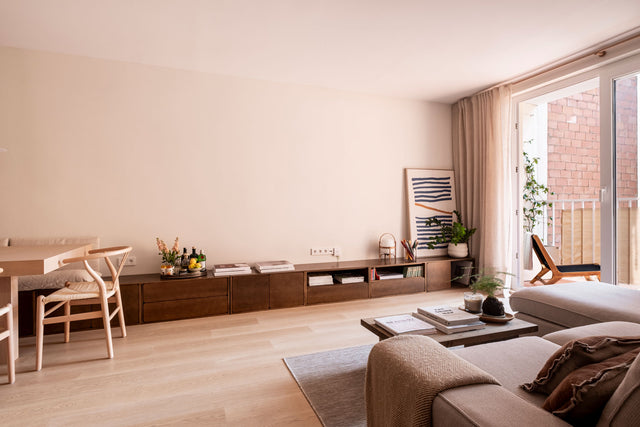
Color coordination with existing elements
The color selection for TV stand colors You should consider the existing color palette on walls, floors, textiles, and fixed architectural elements that define the living room's color scheme. If your walls are white or light neutral, virtually any furniture color will work, offering maximum creative freedom. This neutral base allows for both safe choices and bold experiments, knowing that furniture can be the focal point of the color scheme without visually clashing with the architecture.
For walls painted in specific colors, the furniture can follow a monochromatic strategy using similar tones but with different saturation or brightness, creating depth through tonal layers. If the walls are light blue, a TV stand A more saturated blue or grayish tone creates harmonious continuity. Alternatively, a complementary color strategy uses opposite shades on the color wheel to create dynamism: warm beige walls combine brilliantly with green or blue furniture that refreshes without clashing.
The flooring, often overlooked in color planning, significantly influences furniture color choices. Dark wood floors contrast beautifully with white TV furniture Creating an elegant duality, light parquet floors allow for furniture in medium or dark tones without the overall effect feeling visually heavy. Stoneware or porcelain floors in neutral grays offer complete versatility, acting as a base that accepts any color scheme without imposing restrictions.

The living room textiles—sofas, curtains, rugs, cushions—should have a chromatic dialogue with the TV unit, creating unifying elements. If the sofa is green, repeating that green or a related shade in the TV unit creates visual coherence, while neutral textiles allow the colorful piece of furniture to be the focal point without being overshadowed. color customization The total we offer allows us to exactly replicate the tones of specific elements in your living room, guaranteeing perfect coordination impossible with standard catalog options.
White: timeless brightness and versatility
The white in TV stand colors It represents a classic choice that never goes out of style, providing exceptional luminosity that visually expands spaces while creating a neutral canvas where other decorative elements shine. white TV furniture They reflect natural and artificial light, maximizing the brightness of the living room—a particularly valuable benefit in urban homes where natural light can be limited. This reflective capacity creates a sense of spaciousness, essential in small living rooms where every visual trick helps the space breathe.
Pure white conveys modernity and freshness, appropriate for modern living room decor with a minimalist or Scandinavian aesthetic where visual clarity is a priority. Nolla white TV unit With its cannage grid details, the purity of white is combined with texture that adds interest without compromising brightness, proving that white doesn't mean boring when design incorporates distinctive tactile elements. The matte white lacquered finishes offer superior sophistication compared to traditional gloss, creating silky surfaces that better conceal fingerprints and minor marks from everyday use.
Warm or off-whites (ivory, cream, pearl white) bring a warmth absent in pure whites, making them suitable for living rooms where you want to create a welcoming atmosphere without feeling overly cold. These tones work exceptionally well combined with natural woods, creating soft contrasts where white brings brightness and wood provides organic warmth. The white-wood combination represents a balanced duality that simultaneously satisfies the need for light and a connection with natural materials—a winning formula in contemporary interior design.
Maintaining white surfaces is often a concern, but high-quality lacquered finishes with anti-yellowing and stain-resistant treatments make cleaning with a damp cloth a breeze. Contrary to popular belief, a well-finished white doesn't require excessive care and is practically as durable as any other color. This practicality, combined with stylistic versatility, makes white a smart investment that remains relevant even when you completely redecorate your living room by changing wall colors, textiles, or accessories.
Green: natural connection and contemporary sophistication
The Greens in TV stand colors They have experienced explosive popularity as a sophisticated alternative to ubiquitous blues, bringing natural freshness that connects interiors with greenery without excessive literalness. Moss, sage, emerald, or bottle green convey biophilic calm that improves well-being in urban spaces disconnected from nature. moss green TV stand It exemplifies how desaturated green-gray tones bring sophistication far removed from bright, childish greens, creating a distinguished presence appropriate for demanding adult living rooms.

Green functions psychologically as a balancing color that is neither warm nor cool but perfectly neutral, allowing it to be combined with a wide range of colors without clashing. It combines brilliantly with natural woods, reinforcing an organic connection; with golds and brasses, which add understated luxury; or with dusty roses and terracotta, creating sophisticated bohemian palettes. This combinatory versatility makes it green TV furniture function as statement pieces that structure entire color schemes around them.
Dark greens like bottle green or deep emerald add drama and depth, perfect for spacious rooms where the intense color doesn't overwhelm, creating an inviting atmosphere reminiscent of a contemporary British club. These dark shades require adequate lighting to avoid feeling oppressive: combine them with abundant natural light or well-designed artificial lighting that incorporates multiple sources to create layers of light. A matte finish on dark greens enhances sophistication by preventing reflections that would disrupt the chromatic mystery these shades generate.
Light greens like mint, aqua, or celadon bring a luminous freshness appropriate for Mediterranean or coastal living rooms, evoking the sea without the literal use of deep blues. These light tones combine the expansive benefits of white with subtle chromatic personality, a perfect balance for those who find white too neutral but are hesitant to commit to intense colors. Light green's ability to add perceptible color while maintaining visual lightness makes it a smart choice for modern living room decor who seeks personality without substance.
Tile and terracotta: contemporary Mediterranean warmth
Tile, terracotta, clay, and coral tones represent a resurgence of warm Mediterranean palettes reinterpreted with contemporary sensibility, providing an enveloping warmth that invites socializing and lingering. These earthy orange-reds connect emotionally with traditional Mediterranean architecture—terracotta roofs, whitewashed facades with terracotta moldings—translating cultural heritage into a contemporary design language. TV stand colors These warm tones create a welcoming presence that transforms living rooms into havens where you can enjoy being together.
Terracotta works exceptionally well in rooms with abundant natural light, where its rich color palette is fully appreciated, developing nuances that shift depending on the time of day and the angle of the light. These chameleon-like qualities keep furniture visually interesting, avoiding the monotony of flat colors that look identical under any lighting. The inherent texture of matte terracotta finishes enhances this chromatic depth, creating complex surfaces that invite close observation, revealing subtle tonal variations.
The combination of terracotta and natural wood creates a warm duality where both materials enhance each other: terracotta provides color while wood adds organic texture. modular TV furniture They allow combining terracotta modules with others in natural wood, creating rich compositions where material alternation generates visual rhythm. This mix avoids the monotony of completely monochromatic furniture, maintaining coherence through a controlled palette of warm, earthy tones.
For modern living room decor For those seeking warmth without sacrificing sophistication, muted terracotta or desaturated coral represent a contemporary evolution of the vibrant oranges of the seventies, maintaining a warm spirit with modern elegance. These shades combine brilliantly with greens, creating natural, complementary schemes; with navy blues, generating bold contrasts; or with neutrals, allowing terracotta to take center stage as the sole color. The stylistic versatility of terracotta, from bohemian to contemporary Mediterranean, demonstrates that when used well, this color transcends specific trends, achieving timelessness.
Recommended collections by color
White TV furniture: luminous purity
Nolla 150 Pearl White TV Unit
A 150cm modular system in matte pearl white lacquer that combines luminosity with a silky texture. Three push-to-open doors eliminate handles, maintaining a completely smooth facade. The interior features adjustable compartments and integrated cable management.
Nolla 200 White Curvy TV Unit
This 200 cm composition features a pure white lacquer finish with handcrafted cannage mesh details. The combination of smooth surfaces with a woven texture creates visual interest while maintaining color coherence. Perfect for living rooms seeking sophistication without excessive ornamentation.
Fitxa White TV Unit
Design with white drawers combined with eco-friendly varnished natural pine wood. The drawers provide secure storage, while the top surface accommodates decorative items. The white-and-wood duality creates a warm contrast suitable for Nordic or Scandinavian aesthetics.
Green TV furniture: natural freshness
Nolla 200 Moss Green TV Unit
A modular system in matte lacquered moss green that provides a natural connection without being literal. Three compartments with soft-close doors and a superior hinge system. The white interior contrasts elegantly with the green exterior, creating a surprising surprise when opened.
Nolla 200 TV Unit Moss Green and Wood
A mixed composition combining two moss green doors with a third in natural wood creates a dynamic visual rhythm. This alternation of materials and colors generates a compositional richness suitable for living rooms seeking personality without being ostentatious. The matte green finish contrasts with the natural wood grain.
Willa 180 Green TV Unit
180cm design in high-density MDF lacquered in deep bottle green. Structure with tapered legs that raise the unit off the floor, giving it a light and airy feel. Two side doors with an open central compartment, perfect for a receiver or soundbar. Sophisticated matte finish.
Terracotta TV furniture: Mediterranean warmth
Totem 200 Terracotta TV Unit
Bold design with organic curves in coral terracotta that brings enveloping warmth. The rounded shapes soften the piece's presence, making it suitable for family rooms where child safety is a consideration. Four doors with spacious compartments and an open central shelf.
Nolla Customizable Terracotta System
Customizable modular configuration in any specific terracotta shade using hand-applied lacquer. It allows for the exact replication of existing elements in your living room, guaranteeing perfect coordination. The customization process includes physical color samples for approval before production.
Terracotta Modular TV Furniture
A system of independent, lacquered terracotta modules that can be combined to create compositions ranging from 100 to 300 cm. Modules can be added or removed as needs evolve. Terracotta can also be combined with natural wood in the same composition, creating warm contrasts.
Color combinations that work
Monochromatic: elegance in tonal layers
Monochromatic combinations use the same base color in different saturations, brightnesses, or textures, creating depth through subtle tonal layers. white TV stand In a living room with off-white walls, a cream sofa, and ivory textiles, a serene atmosphere is created where tonal variations add interest without abrupt contrast. This approach works exceptionally well in modern living room decor minimalist where chromatic discipline creates impact through intentional restraint.

To successfully execute a monochromatic scheme, vary textures and finishes to avoid flatness: combine smooth lacquered furniture with bouclé textiles on the sofa, crinkled linen curtains, and matte handcrafted ceramics in accessories. This tactile diversity compensates for chromatic uniformity, maintaining a visually stimulating space. Lighting becomes critically important, revealing tonal subtleties that would remain invisible in flat light, requiring multiple light sources that create shadows and highlights, enhancing layers.
Analogous: natural harmony
Analogous color schemes use colors adjacent on the color wheel, creating smooth, naturally harmonious transitions. Green-blue-turquoise or orange-terracotta-red generate gradations that the eye finds pleasing due to their presence in natural landscapes. green TV stand In a living room with light blue walls and turquoise textiles, a refreshing chromatic continuity is created, appropriate for warm climates where visual freshness provides psychological comfort.
This approach allows you to incorporate multiple colors without cacophony, maintaining coherence through chromatic proximity. You can be bolder with saturations, knowing that the color family unifies the space: intense emerald green in furniture, grayish blue on walls, and saturated turquoise in cushions work together because they belong to the same spectral range. The key is to vary saturations so that one element takes center stage while others support it without competing.
Complementary: balanced drama
Complementary colors—those opposite each other on the color wheel—generate maximum contrast, creating a vibrant dynamism appropriate for bold personalities. Green and terracotta, blue and orange, and violet and yellow intensify each other when they coexist, a stimulating effect that keeps spaces visually active. A terracotta TV unit against a sage-green wall creates chromatic tension resolved through compositional balance, where both tones occupy balanced proportions, avoiding a dominance that would be visually aggressive.
To create complementary colors without jarring contrasts, desaturate at least one of them by reducing its intensity: muted terracotta with deep bottle green is more sophisticated than fully saturated versions of both. Introduce generous neutrals—whites, grays, natural woods—that mediate between complementary colors, giving them room to breathe. Modular TV furniture , combining modules in complementary colors with neutral ones allows you to enjoy contrast without visual saturation.
Accented: controlled prominence
The accentuated scheme uses a dominant neutral base (white, gray, beige) with an injection of intense color in a specific element that functions as a focal point. A completely neutral living room with emerald green TV stand It creates a dramatic impact where concentrated color takes center stage. This approach facilitates future decorative evolution: changing or repainting furniture completely alters the character of the living room without touching walls, floors, or architectural elements.
The typical ratio in accent color schemes is 60% neutral, 30% soft secondary tone, and 10% intense accent—a formula that guarantees visual balance. In practice: white walls (60%), light gray sofa (30%), terracotta TV unit (10%), plus repeated terracotta accessories creating chromatic threads that distribute the accent color, preventing it from appearing isolated. This conscious distribution of the accent color through repetition in smaller elements—cushions, artwork, potted plants in terracotta—integrates the furniture into the overall chromatic narrative of the living room.
Finishes and textures that enhance the color
Matte lacquers: contemporary sophistication
Matte lacquered finishes in TV stand colors They represent a sophisticated evolution from traditional gloss finishes, creating velvety surfaces that absorb light softly without reflections. This finish enhances chromatic purity, allowing color to fully express itself without the light distortions that gloss finishes generate. Matte lacquers also better conceal fingerprints, minor scratches, and marks from everyday use—a valuable practicality for furniture that you frequently touch when using controls or adjusting devices.
The artisanal matte lacquering process requires multiple layers with intermediate sanding, building a chromatic depth impossible in quick industrial applications. This accumulation of layers generates rich saturation where color seems to emanate from within the piece of furniture rather than simply coating its surface. color customization The artisanal lacquering process guarantees perfect uniformity without tonal variations between pieces.
Combinations with natural wood
The juxtaposition of lacquered surfaces with natural woods creates material-chromatic contrasts that enrich Modern living room decor . A green and wooden TV stand It alternates lacquered modules with others that reveal natural oak or walnut grain, creating a visual rhythm where material alternation energizes the composition. This mix also provides organic warmth that saturated colors alone might lack, a perfect balance between chromatic boldness and a natural connection.
The proportions of color versus wood dramatically influence the result: a predominance of color (70/30) creates a strong chromatic presence with a natural accent, while a 50/50 balance generates duality where neither element dominates. For living rooms where natural wood already predominates in floors or beams, inverting the proportion with more color in the furniture creates a refreshing contrast. The versatility of modular systems It allows you to experiment with different proportions until you find the perfect balance for your specific space.

Textures and reliefs
Textured finishes—grooves, geometric milling, reliefs—add a tactile dimension that enhances color perception through plays of light and shadow. Vertical grooves milled into a lacquered surface create a linear rhythm where grazing light generates tonal gradations from maximum saturation on the foreground to deep shadows in the channels. This visual complexity transforms flat color into a dimensional experience that changes according to the viewing angle and time of day.
The handcrafted caning on doors adds a woven texture that breaks the monotony of smooth surfaces, maintaining color consistency if the caning is lacquered in the same tone as the frame. Alternatively, leaving the caning in its natural rattan while the frame is lacquered creates a material contrast that adds organic warmth. TV unit with caning It demonstrates how artisanal texture elevates simple design into a memorable handcrafted object.

Lighting: the factor that transforms color
Natural and artificial lighting dramatically alters the color perception of TV stand colors requiring careful consideration during selection. A green that looks perfect under natural daylight can turn grayish under cool LED lighting at night, while a vibrant terracotta of the day can become excessively dark under warm tungsten lighting. This chromatic variability depending on the light source necessitates evaluating color samples under multiple lighting conditions before making a final decision.
South-facing rooms receive abundant warm natural light, which intensifies warm colors (terracotta, reddish woods) while potentially flattening cool colors (blues, greens). In these spaces, cool colors may need higher saturation to maintain presence under the dominant warm light. North-facing rooms with consistently cool light favor cool colors, allowing them to fully express themselves, while warm colors may need the help of warm artificial lighting to compensate for the natural coolness. Evaluate your room's orientation before selecting a color, considering how the specific natural light in your space will interact with your chosen hue.
The color temperature of artificial lighting (measured in Kelvin) has a significant impact: warm bulbs of 2700-3000K intensify warm colors and yellow whites, while cool LEDs of 5000-6500K enhance cool colors and can make warm colors appear dull. For living rooms with White TV units with neutral 4000K lighting maintain the purity of white without any yellowish or bluish tint. Dimmable lighting systems with adjustable color temperature offer maximum flexibility, allowing you to adapt the chromatic atmosphere to the time of day or specific activity.
Directional lighting using spotlights or LED strips can dramatically enhance a TV unit, transforming it into a sculptural element at night. Grazing light from above or below emphasizes textures and reliefs, creating shadows that add dimension. For furniture in saturated colors, accent lighting intensifies color perception, making the color the absolute protagonist of the living room after dark. This dramatic lighting transforms a functional piece of furniture into a work of art that shapes the entire atmosphere of the space during the hours of reduced natural light.
The color of TV stand colors The furniture you choose for your living room transcends purely aesthetic decisions, becoming a psychological, spatial, and compositional factor that defines how you experience the most social space in your home every day. Modern living room decor , where the TV unit inevitably acts as a focal point that visually structures the room, its color dramatically impacts the overall atmosphere, perception of spaciousness, and decorative coherence. Color options range from bright whites that expand spaces, passing through sophisticated greens From colors that connect with nature to warm terracotta that envelops you cozyly, they demonstrate that there is no universal correct color choice but rather a perfect shade for your specific space, light and lifestyle.
At SlowDeco, the full color customization Through artisanal lacquering, we can materialize exactly the color vision you imagine, freeing you from the limitations of standard catalogs with reduced options. modular TV furniture They also facilitate mixed combinations where color interacts with natural wood, creating rich compositions that transcend monochromatic monotony. The color choice deserves time and careful consideration, evaluating samples under natural and artificial light in your specific living room, ensuring that your investment in handcrafted furniture results in a piece you love every day for decades of satisfying use in the heart of your home.
0 Comments
There are no comments for this article. Be the first one to leave a message!